
TO CREATE AN EFFECTIVE LOGO DESIGN, FOLLOW THESE 5 STEPS
- michaelkwilliams16
- Dec 16, 2020
- 5 min read
In many ways, branding is a great optical illusion. Good branding seems simple on the surface, but it is really the product of extensive research and design.
Think of all the behind-the-scenes effort you put into creating a great customer experience. All the details that customers don't see are the true secret of branding construction. However, most of your hard work comes down to a handful of direct contact points. Fortunately, you can level the gaps in experience to increase loyalty.
Increase the visibility of your brand with a logo
Start by designing a logo for your company. When you give your customers a visual brand that they can focus on, it acts as an emotional trigger. Customers don't have to see all the work it takes to get there, to know what makes your small business special. Give them positive experiences, and the meaning of your brand will be reinforced each time your customer sees your logo.
What steps should you take to create an effective logo design?
1. Get real insight into the way customers perceive your business
2. Tell a visual story that shows the customer experience you offer.
3. Incorporate a creative point of interest to make an impact.
4. It seeks to achieve a visual balance in terms of shape, color and action.
5. Test the recognition value of the logo.
Let's look at all these points in more detail.
Understand customer perceptions
What you want to project and what others see are not always the same. If you are having trouble coming up with good logo ideas, it may be that you are emphasizing the wrong things. Do yourself a favor and stop guessing.
Find out what exactly loyal customers love about your business. While this is not possible for a new business, you can also introduce your brand concept to potential clients. Ask them to write a few words to describe your message, compared to a specific list of competitors.
Do your consumers agree on what your business represents? Are their perceptions consistent with the message you are trying to communicate?
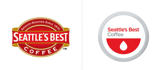
Consider rebranding Seattle's Best Coffee. For years, the company had a red and gold emblem-style logo with a ribbon surrounding an oval. The company changed to a red half circle with a white drop inside. The new design was sleek and modern, but there was one big problem. The sterile look combined with the colors and shapes instantly reminded clients of a blood bank. Obviously not the connotation you want for a beverage company.
A brand logo is part of your company's history, but it exists to serve consumers - not you. If you don't consider their opinions, you may find yourself in trouble investing money in an embarrassing design.
Deliver an accurate visual story
Match your brand goals with the perspective you get from your consumers. The words they use to describe your brand should help you choose fonts, symbols, and colors. Imagine the kind of story you would tell about an environmentally friendly construction company.
What is the history of color? Green is an obvious place to start, because the company is involved in creating, nature, and environmental safety. Gray and blue are common corporate colors that can complement a well-established, traditional business.
Now what about fonts and shapes? Most people associate contractors with strength, stability, and precision. Clean geometric designs and bold typefaces work great to convey a sense of durability and integrity.
Take into account industry trends and standards when making design choices. The goal is not to be like everyone else, but to avoid conflicts inherent in the brand message.
Show a point of interest
Most logos are neither good nor bad. They are just boring. The truth is that it is better not to have a logo than to have a design so generic that everyone will forget it in five seconds. Focus on how to take a design from obvious to interesting. The smallest touches can add deep meaning and action to an otherwise very simple logo.

And keep in mind that boring is not the same as minimalist. Beats by Dre and IBM offer simple but effective design examples. The Beats logo is a red circle with the letter "b" inside. To add impact, the lyrics are reminiscent of the side profile of a person with hearing aids. It's a simple, clean, and smart way to represent the experience of listening to music.

The IBM striped letters were made to represent speed and dynamic change. The logo employs a common optical illusion to create the appearance of movement. The result? The bold serif typeface and stripes remind you that IMB is a strong, enduring company that looks to the future.
As you look at your logo sketches, ponder features that make you stand out from the competition. How can you weave one or two subtle details together to illustrate that point that makes you different?
Keep a visual balance
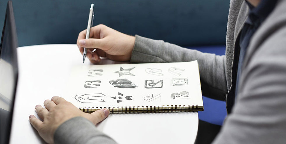
Before creating a logo, accept the fact that you won't become a design guru overnight. Working with designers or a logo builder can help you produce a clean design. Yes, of course it is worth brainstorming and sketching ideas, whether you do it alone or not.
Take the time to learn some design principles. Better yet, look at the big brands for examples of effective logo designs. Color and geometry play an important role in visual impact. You can prevent many bad starts by simply looking at what works and what doesn't. One thing you will discover immediately is that most logos have a natural symmetry.
Focusing on balance helps logo designers see elements that stand out for the wrong reasons. Make the design process easier for yourself and start with very basic and symmetrical shapes. If you add something to one side of the design, make sure it doesn't look too loaded to the other side.
As you develop your designs, pay attention to how the shapes interact. Many logo disasters happen when designers don't see the secondary action in the image. The infamous 1970 Catholic Church Youth Commission logo has been the focus of ridicule for years.
Test the recognition value
At the end of the day, clients are the true judges of an effective logo design. Before going ahead with a big branding effort, always test your logo. At this point, you are already attached to your logo and are not the best person to criticize it.
Get unbiased feedback from people who have different levels of familiarity with your brand. Provide some details about your positioning to give the logo context. With a minimum of information, people should be able to guess what your logo represents.
Support your logo with consistent branding
As you delve into your design, remember that a logo is not a magic ingredient that will transform your company. The power of the logo comes from the brand itself. Building a strong customer base is the most effective way to grow your business. The logo is just a mascot that ties in with the brand's values and makes it easy to connect with customers on key marketing channels.


Comments