
HOW TO USE NEGATIVE SPACE IN YOUR LOGO DESIGN (EXAMPLES)
- michaelkwilliams16
- Dec 16, 2020
- 3 min read
If you're just starting out as an entrepreneur or a business owner, you may not know much about logo design yet. Before you start planning your first logo design, take some time to learn about some of the tips and tricks needed to create a memorable and attractive logo. One trick to consider is to use negative space in your logo design.
What is negative space?

According to Creative Blog, negative space is "the space that surrounds an object in an image." It is the space without content, the spaces between the words, and the space that surrounds the symbols in your logo.
A perfect example of the above is the 1986 NBC logo. The iconic logo craftily displayed a peacock's feathers in bold colors, but used negative space to represent the bird's body.
Create a brain game
Negative space is often used to play with the viewer's mind. Many works of art use negative space to communicate another aspect of meaning or to mislead the viewer about what they are seeing during the first few seconds.
In the world of logos, a perfect example of the use of negative space is found in The Guild of Food Writers ' logo . The logo displays the organization's name in a simple black sans-serif font. Above the name is the tip of a fine fountain pen. However, in the space between the two tips of the nib is the shape of a spoon. The image is simple, but it communicates both concepts of the brand perfectly: creating high-quality content and food.

Create a symbol by combining letters
If you are interested in using negative space, try to put together the letters or symbols in your logo as much as possible, and see what happens. Have you ever noticed the arrow hidden in the FedEx logo
The negative space between the "E" and "x" forms a clear white arrow, which excellently illustrates the forward movement of the mark. Once again, the logo is very simple, but uses color and negative space so effectively that it has won multiple design awards.

Make a cutout
Is there a symbol that you already use for your business? Place that symbol in a solid color against a white background and pay close attention to what's there. Is there any part that you can cut out to reveal a second shape that also reflects your company and its mission?
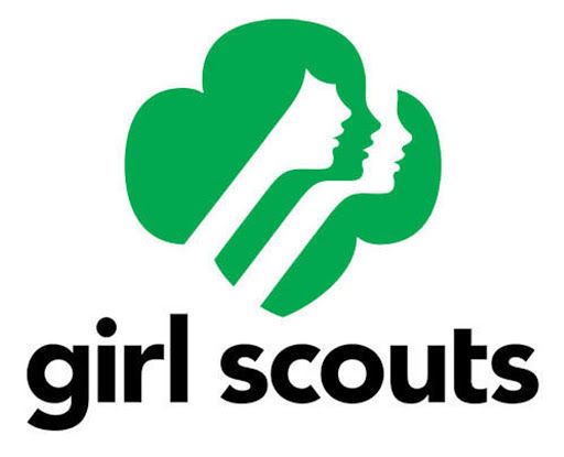
The Girl Scout organization based its logo on the shape of a girl's face, literally putting girls at the forefront of the brand.
Put words in the picture
You can also make an iconic image bigger and add text inside using negative space. The Boom! Burgers, shows the black shape of a cow, with the word "Boom" inside, using negative white space.
The exclamation point creatively becomes the tail of the cow. Since cows are usually drawn with black and white spots, the image makes visual sense to viewers, while also making a big impact.

Use the product image
Alchimiste Microbrasserie a beer manufacturer in Joliette, Quebec, in Canada; it uses the "A" as part of its logo, but instead of sticking with a simple capital letter, they converted the negative space inside the "A" into the shape of a beer bottle. Maybe there is a way to achieve the same with your logo.

For more ideas about using negative space in your logo design, take a look at our logo maker templates . Remember to keep the use of your negative space subtle but effective, and you will be successful in gaining the attention of your target audience.


Comments